Colour-another perspective

Kia ora tatou:
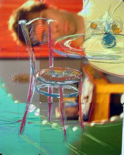
With all this discussion on colour, I thought it was time to call in the big guns, in this case my friend and colleague Mark Soltero. Mark is a painter, and therefore has a perspective on colour that I have only begun to acquire (largely because of him-many thanks, Mark!). So I have asked him to chip into this debate and contribute a post ( or 30). He writes:
"American Color" (spelling kindly noted) is a term in itself. As an "American" overseas it seems easier for me to 'see' the States. It was Robert Hughes' "American Visions" video series on the Art Historical perspective of 'home' that really opened my eyes.
But going back in time one can think of colour or color and it's uses - the book on the history of colour (out last year?) goes back in time tens of thousands of years and one realises or realizes the significance that colour has played in whole human drama. We now know we see 'so little' of what's available and yet we also know, on a totally different level, what a huge role colour plays in our lives.
Some facts (for me):
1. Colour never exists in isolation - even for the blind - it has a feeling, a taste, a sense, an association, and so much more
2. Colour is so often abused (due perhaps to our 'ability' to use it without having to think much and this of course has an effect on our experience or our 'un-education')
3. Our 'un-education' seems to have some common ground: we're taught there's no such thing as black and white (teachers and 'facts'?!) and that there are these things called 'primary colours' and so on and so on. On a simple level colour can divided into pigment and light – and the ‘truths’ we talk about can be discussed as belonging to one or the other or a partnership of the two as is often the case.
4. We tend to think of and talk of colours as if there was ‘one’ of each and perhaps slightly different versions of a given ‘one’. This is an indication of our misunderstanding of pigment vs. light and our ‘un-education’.
Take red for example: In oil paint there is the king; Cadmium Red. It’s scientific code is PR101. But there are so many different levels of quality. Cadmium is often replaced now with Barium (due probably to cost and safety) but one can still find the pure stuff. By looking into just one colour we can see there are even more than we could cover in several pages. Take commercial auto paints. There are several official reds for Porsche – one of which is called “Guards S” which is a kind of orange-y red. But have a look at the official manufacturer’s colour list for cars and you suddenly notice a list with literally thousands of names. No wonder they end up giving them strange descriptors like “pearl apple”.
There are literally 1000’s of new (commercial) colours developed each year. I can’t keep track of all the whites. But the commercial area is a good one to examine this. Because there is supply, so we can assume demand (?) These colours are often experienced outdoors unless you like to look at auto mags (come on – confess) and then we contend with light, reflective light, varnishes, dirt, waxes etc. It never exists without other things – so much so that we can hardly begin peeling back the layers until we become tangled-as I have in my little bit of writing here.
I’ll pick up a thread (perhaps green) next time and see where it gets me. Cheers.


0 Comments:
Post a Comment
<< Home