The Art of Seeing Part IV-practising your scales

Warning: yet another heavy-duty Post!!
Kia ora tatou:
A lot of years ago, my mother decided it would be good for me to learn the piano. So she sent me along to Mrs. X, a woman of (it seemed to me at the time) fearsomely advanced years. For a year or so we suffered each other. She would snarl at me, and I would wonder if she was on holiday from Dachau.
Each week I would (reluctantly) show up to demonstrate my (remarkable) lack of progress; each week she would admonish me for my bad hand position by giving me a clip over the knuckles with a brass-edged ruler. Then she would send me home to practice my scales, which I always avoided wherever possible. There was inevitably something much more important to do.
My sister, who was learning from her as well, practised assiduously each night. Curiously enough she got very good at playing the piano. And I did not. Playing Chopsticks was about my lot. After a year or so, my mother decided I should cut my losses and move onto show jumping…
You may be wondering about the point of this post. Well, read on.
Somewhere in The Art of Seeing Part III, I talked about Closing the Gap and the importance of scene analysis. I suggested ACE as an acronym to help you develop a methodology for approaching a photograph. This is a system that can produce a more systematic structure to the decision-making involved in every photograph. It is easier to do with landscape photography (although that requires as acute a sense of time and place as any other form of photography) than perhaps sports or documentary photography, both of which require split-second decisions. So this is a good place to develop the habit. Practice it enough and it will become second nature. As any martial artist will tell you, it takes at least 300 repetitions of a kata (a kind of ritualised pattern containing a variety of specific techniques and combinations) before it begins to reach the subconscious and become second nature.
As Bruce Lee once said:” if you think, you are dead.”
Nobody is suggesting that you should use your trusty 350D for hand-to-hand combat, but the principle is the same. The more you practise, the more instinctual everything will become. And great photographers are always practising. The more you do it, the better you will get. If you can discipline yourself to make at least 10 images every day, you will be amazed at how quickly you progress. If you play a musical instrument (I play a really mean car stereo), you know what I am talking about. If you ever took piano lessons and remember doing scales (a form of torture for me) then you understand. Photography is no different.
Q. What is the way to Carnegie Hall?
A. Practice, John, practice.
Now it is time to talk about the vexing question of composition, or design of a photograph. Remember that we have only two decisions to make in photography: where to stand, and when to push the button (David Hurn/Magnum). Essentially composition is about structure, and a natural follow-on from scene analysis. To start gripping onto this, it is important to remember what you are looking at:
A series of lines, patterns, forms, structures, etc. reflected onto a ground glass.

Take your eye slightly away from the viewfinder and defocus a little and you will see what I mean. By doing so you are able to become a little more objective and look dispassionately at what it is you are photographing. This is important if you are to develop a sense of design.
I can hear voices saying: but what about those people who seem to have a natural sense of design? True, but I wouldn’t mind betting it is something they have been doing since childhood, and a good sense of design comes from constant practice. If you spend every day looking at how things are designed and the design elements in what is in front of you because you love it and that is what you do, then of course you will become design-oriented.
Practice, John, practice.
I can hear one or two of you saying: so when is he going to tell us a few secrets of how to be better at composition? What about a few rules?
I wouldn’t be that disrespectful. And you are in the wrong place.
There are any number of books that will give you “the rules”. Better still; go to your local camera club. You will find plenty of people with firmly held views on where subject matter should be placed in a photograph…
What I can suggest is that you take images you like and analyse them. If you don’t think much of your own, then find ones you like by ‘Big Names’ and analyse them.
If you have taken the hint and got yourself a visual diary, then you may be wondering what to do with it. Here is a suggestion.
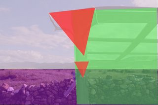
At the top of this post is my Homage to Alfred and Georgia photograph (taken incidentally in the Wairarapa!). At the top is the original.
Next down you will see where I have drawn (rather badly) over the top of it in PhotoShop. Hint: it’s a lot easier with a pen. I have broken it down into its composite primary shapes. The sky and hills form one significant rectangle. The grass and the fence down form a smaller but still significant rectangle. Because the sky was so dominant, I gave it greater weighting. It also contains less information, so it needs more space to compete.
Over the top of that is the rectangle formed by the pergola-thingy. As you will see, I have allowed it a little less than 50% of the horizontal picture space to give the eye a bit of a chance to hop round to the left.
The final significant shapes are the two downward-pointing triangles formed by the skulls.
 Although they occupy a small part of the picture space, they are dominant because they are well to the front of the photograph.
True, there are a lot of smaller secondary elements, which are important as well, but it is the arrangement of the primary elements that is of greatest significance.
Did I consciously think of all this at the time?
No, not really.
Because I practise my scales.
The point here is that post-analysis is a bit like practising your scales. Take your images, print them out, stick them in your visual diary, then do the analysis exercise I suggested above.
You may be amazed at how quickly this informs the way you apporioach a photograph out in the field.
Ka kite ano


1 Comments:
Hi Tony
I like this post and one sentence has been a revelation to me.
As long as I have been interested in photography (I got a Diana camera for christmas about 1970 which sparked an interest) I have composed my photos as shapes. For some reason in photos I have always looked at the way things relate to/ blend into/ play with/ interact with each other. As I read through this article I saw DEFOCUS. Without even reading the rest of the post I was excited. This is something I have never done. Often I find myself confused with the detail within a component of my composition, I sometimes look at the little things that may not contribute strongly to my picture.
Anyhow, I'm excited. I now have another powerful tool in my arsenal, well nearly. I've been practising this idea since I read it. I now have my inbuilt analytical composition method and I have the defocus method. I may not have quite mastered it yet but so far I have tried the defocus left eye (right eye viewfinder) method, and the peep over the top of the camera two eye method. I think the two eye method is more accurate so far, reason being the perspective is correct using this method and (I have astigmatism in my eyes) I can keep my horizontals horizontal-ish.
I'm finding a slight squint (and set your eyes to around f/2) is enough to lose confusing detail in your composition and let you see shapes.
Thanks Tony, one small word on a web blog - one giant step for photographers.
I think if I can make this a habit it will add a lot of value to my photography, I'll let you know.
Cheers
Andrew
Post a Comment
<< Home