BluePrintX

Photography should be about picture-making. That is, after all, why we get into it in the first place (well, most of us). This blog is for photographers, people passionate about making photographs, who want to share ideas and concepts, approaches and attitudes. And yes, there will, from time to time, be gear stuff. Oh, and by the way, while you can download and share this blog, all the material on it is copyrighted. All rights reserved, etc.

Monday, February 27, 2006

The Tyranny of Choice


Kia ora tatou:

John W writes in a comment:
I remember a lecture you did on films and colours, Fuji, Kodak and Agfa all giving you different versions of tone of the same colour. Just wondering do you think you get the same thing with image sensors on the digitals... does the image sensor on a canon give you a nicer skin tone for example than a Nikon or a Pentax?... should these be things we're thinking about when we're working through our RAW conversions?

John, to my way of thinking, the answer is yes…and more. Let’s think about it.

The first thing that photon about to form your image runs into is your lens, and the intentions of the lens designers, namely the quality and chemical composition of the glass and the coatings. A few years ago, I switched from Nikon to Canon (I was using film then) and noticed a lack of contrast and a certain muddiness in the colours of the Ektachrome E100 I was using at the time. At first I thought it was the film stock, but a few tests resolved (pardon the pun) that it was the lenses. Switching to Fuji film made everything come right.
Lesson: the lens manufacturer’s design philosophy colours your image-literally.

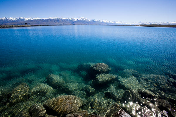
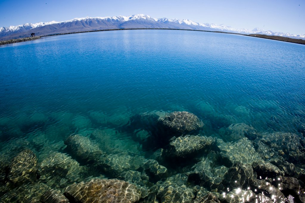
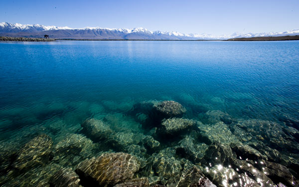
Then there is the sensor. Again, it is like buying a roll of film. You are buying into the sensor (and software) designer’s philosophy. Some manufacturer’s use a CCD, others a CMOS sensor, while Fuji use the Super CCD. All are different, and each has its own personality. Try the same shot in RAW on the same subject and you will see what I mean.

Even the same sensor on a different camera will impart a certain feel to an image. (Which is why I am after a D30, if anyone knows the whereabouts of one for sale). As an example: I had a brief fling with a D70s between my EOS 10D and the ID Mk II I went on to own. Frankly I hated the colour off the sensor and the palette seemed to overaccentuate the blues. Not to mention the harshness ( read: noise/contrast combo) out of the sensor. However that probably comes from my preference for the Canon “look”. My friend Anthony McKee is getting stunning quality from his D70 and now D200.

Finally there is the Raw Converter you use. Have a look at one of my first posts in this blog. It has to be said: your final image is coloured by the RAW converter you use. Again you are inheriting a design philosophy foisted on you by a manufacturer's concept of what that should be.
Oh, and did I mention the choice of printer...and paper...and ink stocks???

Nothing is new under the sun. Ansel Adams had lenses he favoured because of their unique tonal qualities. He chose different developers to suit the image he was producing. He used a range of papers from different manufacturers to achieve what he wanted.
He called it previsualisation. In other words, having your process so down that a previsualised result become predictable and achievable. Experiment and practise. The more you do it, the quicker you will get on top of process. As he said:
the way to Art is through Craft, not around it.

The trick then becomes to mix-and-match the different components of your system until you get the look you are seeking.

Assuming, of course, that you have put the time into deciding what that is.
Ka kite ano

Formal announcement

Kia ora tatou:
I guess it is time to come out...matrimonially speaking.
As many of you will probably know, my marriage has come to an end after some 30 years. Those of you who have been there, done that will know that it isn't easy, and that everything seems quite topsy-turvy. Actually, Hell is a better word.
For that reason I have decided to suspend my teaching at Canterbury University for the near future, while I consider future options. However, I still want to maintain contact with you all, and offer something in return for your friendship and for what photography has given me. Hence the blog. It is wonderful to see the comments that are coming through.
May I publicly thank those of you who were once students and have now become dear and cherished friends.
I am deeply, deeply grateful for your aroha, concern and support.

piki te ora
piki te marama
piki te kaha

ka kite ano

Friday, February 24, 2006

Musings in the Realm of Colour


Kia ora tatou:
I thought I would pick up on a comment by Pete McGregor on the 2-cigarette method post
He writes:
I admit to an irritation with the hegemony of Velvia and similar ultrasaturated films, particularly when they're used for landscapes. They have an important function, but their mindless use (because that's what editors want and it's what we're now used to viewing) annoys me. Subtlety allows me the opportunity to think for myself rather than be shouted at.

Pete, I totally agree-mostly. Extracting subtle colour from an image is way more difficult than just using super-colour. It requires a much more considered approach and considerable searching.
That said, we have a choice of palette. Now I am going to stick my neck out and say this:

Too few photographers have given much thought about colour and what it means to them personally.
It shows in their images, in colour schemes that grate, or add nothing to an understanding of the image. Worse still the palette interferes with a reading of an image.

Because we all grow up with colour, we tend to take it for granted. Because colour has emotional power, it easy to try and inject extra power into an image, especially if we are trying to influence a competition judge. The result can be sickly, sentimentalist and/or in bad taste.
Understanding colour takes time, study and practice. Picasso did it for blue during his blue period. Matisse developed and passed on an understanding of red that was extraordinary. They focused on an aspect of colour and deepened their understanding and hence practice by working with it, digging deeper and deeper until…well, actually there is no until. The layers continue on.
You can do the same. Pick a colour and stay on its case, growing your understanding. Colour is music for the eyes and mind. If you see red as heavy metal, then yellow may be rock ’n’ roll. And blue?
My own palette varies. But I have made a choice. Let me explain.
It began with this image by Magnum photographer Costs Manos, lifted from his book American Color. The humour of the image appeals, as well as the cultural references to Back to The Future and Americana. But it is the strong palette with the intense reds and deep shadows playing off against the softer colours near the back. The lines of red soldiers suck you into the image, As I read through the book I realised how he uses colour in a larger-than-life-way to underscore the larger-than-lifeness of American culture.
Then I went for a drive. A nice sunny day, with hard-edged shadows, intense blues and a steely edge to the light. And I saw what my own palette should be. This is a country of strong contrasts and exquisite intensity. The colour range is somewhat limited however. So my palette has tended to reflect this. I want to replicate the intensity of my feeling for my country and the clarity of its light.
That was then. This is now, and I confess to a move to a softer palette. Rainy, grey days are a challenge and a side of the palette I personally want to explore.
Whatever you choose, at least make a choice. Colour is not something twee that has sensationalist value.
No, it is way more dangerous than that.
Ka kite ano.

Thursday, February 23, 2006

Canon"s new Toy


Kia ora tatou:
Well, the speculation is over.
If you were thinking of getting a 20D or moving up from your 300D or even that trusty K1000 film camera....DON"T!
The 20D is now officially obsolete and has been replaced by the 30D. No, it's not the 3MP D30 (remember them?) so you'll have to make sure you say the name correctly, if you don't want to confuse the staff at your local camera store!
By all accounts it will be cheaper than the 20D and better. Don't expect to see one much before September however.
Read about it here or here.
And no, you don't get the lens with it!
Ka kite

Tuesday, February 21, 2006

The Nature of Seeing Part 1


Kia ora tatou
Ok. This is a rather heavy post. It concerns an issue that has become more apparent to me in recent times, namely perception and the nature of Seeing. It goes something like this:

When we look at a scene in front of us, we read it with our minds. That’s right, with our minds, not our eyes. Our eyes in fact deliver only raw data (coloured admittedly by factors like sunglasses, eye defects, excess alcohol, etc). But it is raw data. It is our minds that synthesise and draw meaning from it. So we see what we want to (sic. pheromones), what we have learned to (Why is red?) and what we are programmed to see.

You know the old saw; the camera never lies. Get over it. It has always lied-and always will. The tools for replicating and interpreting our vision have now become so sophisticated that truth is impossible. Or is it?

Let me take you back to the second paragraph? Absolute truth may be a bit difficult, but perceived truth is more accessible. To understand this we need to put time into thinking about the nature of visual truth or reality. If we look into the nature of our own visual truth, then we may begin to realise there is absolutely no need to fit some generic vision of it. We may choose a brighter palette than others because that fits how we see the world; we may prefer to work in black-and-white because tone is of greater significance to us; we may feel that using montage techniques better fits how we see. This latter technique certainly worked for David Hockney during his brief encounter with photography!

What is important is that we take the time to think about how we really see. Then we can develop a visual expression tha meshes with who we aare and how we view our own reality.
I thought I would give an example of what I mean.

I made the above image one day in The Mackenzie Country. What attracted me was the way the light sparkled on the water. I was attracted to the feeling of Space and Time.

It was when I got back to my computer and studied the image that I became aware of what had really attracted me. It was the horizon and the nature of Horizon.

We all know the horizon is curved. Blame Galileo (or was it Copernicus)? Yet we see it as flat. We need to see it as flat. Or do we?
The horizon about 3/4 of the way up the image had a curve on it brought about by the 16mm super-wide-angle I had used. It was that that interested me. How curved did I really want it? Should I straighten it? Would that be more personally truthful?

I opened the image in Photoshop and took to it with the lens correction filter (Filters>distort>lens correction).
I used the remove distortion tool to add curve to the horizon. Mmmm. Instant fisheye. But it doesn’t ring true.

I then went the other way and levelled the horizon. Something seemed to go out of the image, some visual truth that I could not accept. Somehow I had produced a truth that was not mine.

In the end I accentuated the horizon slightly. It felt right to me.
It felt true
I invite your thoughts.
Ka kite ano

Thursday, February 16, 2006

Adobe Lightroom Beta 2


Kia ora tatou

i have been trialling the new Lightroom on my Powerbook for the last couple of weeks and comments that it is a new generation of software are all true. This is a very powerful piece of software, that does many of the things you needed several apps for. Its Develop function is amazingly flexible and offers a huge range of ways of fine-tuning an image. A pity the beta is still MacOS only. I can't wait for the PC version!

One more reason to shoot RAW.

Underneath is a sunmmary lifted from Rob Galbraith's site:

Adobe today has posted Lightroom Beta 2 for Mac, the latest development release of its upcoming application for professional photographers. Beta 2 is a Universal Binary, which means it contains native code for both PowerPC and Intel processors. The release notes summarize the changes:

  • Now available as a Universal Binary for compatibility with Intel- based Apple hardware
  • Crop and Straighten tools included in the Develop module
  • Ability to add music to slideshows
  • White balance support for the Nikon D2X, D2Hs and D50
    cameras
  • Ability to create hierarchical keyword sets
  • XMP Import and Export capabilities. (Please consult Known Issues list for details)
  • Improved Edit in Photoshop capabilities
  • Improved metadata handling

The software is a free download from the Adobe Labs web site. Ultimately, the software is expected to ship for both Windows and Mac platforms, and a beta version for Windows is also planned for release later in the extended public beta period. The PhotoshopNews web site has published additional information about Lightroom Beta 2.

Tuesday, February 14, 2006

Back to the Future


Kia ora tatou:
I would like you to have a close look at the picture at right. You will notice the long Canon lens poking out of the cloth. You will notice the idiot with the white cloth over his head, a bit like like having to survive one of those Vicks Vaporub inhalation kits some of us were subjected to as children...you may even notice the cloth itself.
For those of us who have used a 4x5 view camera (and some still do), the cloth is an essential piece of kit. You put it over your head to be able to see the ground glass screen clearly. It is known as a dark cloth. Freely available from any supplier of this sort of camera equipment.
Using a digital camera is a pain when you want to chimp your shot. The screens are never bright enough.
I happened to be out with a group and one of the party had brought his monorail along.
Trying to review a shot, I had ,a brainwave, and asked if I could borrow the cloth. It worked brilliantly.
Every hi-tech digital photographer should have one, if for no other reason than to start a conversation....
Many thanks to Kevin Russell for the loan. Speaking of which, if you are looking for a mint Linhof kit.....
ka kite ano

Wednesday, February 08, 2006

The 2-cigarette method


Kia ora tatou:
I thought I would share this image with you.
I made it last Saturday morning on North Beach, in Westport.
I got up early, wanting to get a dramatic shot of the sun rising over the mountains, and drove down to the beach.
My friend Geoff Schurr came with me. When he woke me up, his first words were:
"Pretty crap day-you want to go back to bed?"
"No, we'll go anyway," I replied. Things have a habit of being other than expected. Or maybe I didn't want to miss the chance to get something....
When we got there, a southerly was blowing, and everything was grey and cold. Why bother, you might ask? Geoff certainly did ask that question. All I could say was-we'll wait and see what happens.
Rewind a few years...
From time to time I would go out photographing with my fiend (sorry, friend) and mentor, Richard Poole, who has forgotten more about photography than I will ever know.
He would park the car, get out and light a cigarette while he looked around. The camera would still be in the car.
When he was done, he might get out the gear. I had no idea what he was up to. Finally, having set it up, he would light another cigarette. Sometime after that he would make an image. Or two. Inevitably he saw things in the scene that would surprise me when I saw the final print. While I would rush round, hopping from opportunity to opportunity, he would work slowly and methodically.
After a while I began to get the idea.

What I learned was that you have to get to know what is in front of you.
And that takes time.
Some years ago, both of us did a workshop with Faye Godwin, the famous English landscape photographer. She said the same thing. Take time to get to know your subject.
And that takes time.
Fast forward.
Last Saturday I was reminded of this. At first I could see nothing. Everything was a monotone, but, as the light shifted, things unfolded subtly. I became more aware of the nuances of tone and colour in the light. I explored with the camera, chimping as I went.
I shot about 135 images in a small area of the beach, then we went back for breakfast, and the chance for me to see what I had got.
This is one of the shy images. Sure, it is quiet, but it took time to see it.
Ka kite ano

Thursday, February 02, 2006

Garry


Kia ora tatou:
I want to share a story.
A few years ago I did a workshop in portraiture. Among the students was this guy called Garry. He got right into it and made some good images.
Over the next year or two he worked through my classes, getting better all the time. I remember one night when he confessed that he always had trouble sleeping after class because he couldn’t stop thinking about how to make his pictures. I told this was good thing.
I think it was Matisse who said” Art is not something you do, it’s something you have to do.
Anyway, he beavered on, getting better all the time until one day over a beer, he asked me what the next step was, where he should go with hiss photography. Why not have your own show? I suggested. He looked shocked and stunned and then a glimmer of joy crept over his face as he started to think.
Garry has been working away for the last year-and-a-half, photographing shopkeepers around Christchurch, where he lives. And the images have gone from very good to fantastic.
His show opens at Our City Otautahi on May 29 and continues to June 24
It’s a wonderful thing when the student overtakes the teacher.

Having your say

Good morning,
I thought that maybe it was time to lay out a few guidelines about comments.
I love comments and the forum aspect to a blog. Please feel free to make lots of comments. I will publish them, but a few suggestions may be in order.
  1. Let’s keep comments impersonal and related to the post in question, that is, along the lines of what you think about the topic, rather than “ I saw you in a bar in Taihape”( it wasn’t me-honest)

  2. No abuse or flaming, but feel free to be contentious. Keep it general rather than going ad hominem.
I note that the blog design has no contact details for me, If you want to email me, you can get me here.
Ka kite